June 10th, 2021
Several years ago I made a career change leaving the actuarial world of insurance and entered the arena of direct mail marketing with a focus on nonprofit fundraising. On the surface these professional worlds seem very different but I discovered that many of the classic actuarial techniques translated nicely into my new world. One of those is the triangle, the bread and butter of actuarial analysis. When well understood it is a powerful tool to understand program health and donor journey.

How do I build a triangle?
A triangle is simply a way of organizing data by dates in order to see patterns in the data. There are many different versions of triangles. It is a compact and rich source method of visualizing information across time periods. Today we will explore the health of a sustainer program as of the end of June 2021.
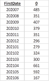
Let’s begin by gathering new donors by month over the course of a calendar year. We will call their inception month to the program “Month 0”.
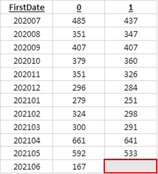
The next natural question is “how many of these donors retained to the next month?” We can see that by adding a new column and thinking of it as Month 1” since it is one month after inception to the program. You may notice the final cell in the new column is blank. This data set is only through the end of June 2021 so we do not yet know if the newest donors will retain next month.
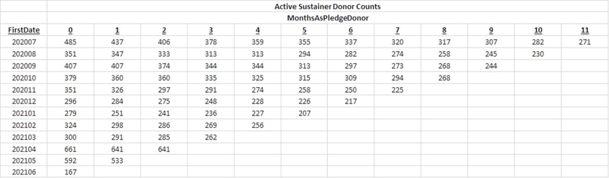
We can continue this concept looking at how many of the new donors give 2/3/4/etc. months past their inception month. This is how a triangle is built.
How do I read a triangle?
The beauty of this structure is that it can be read in three different ways.
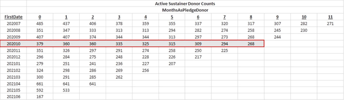
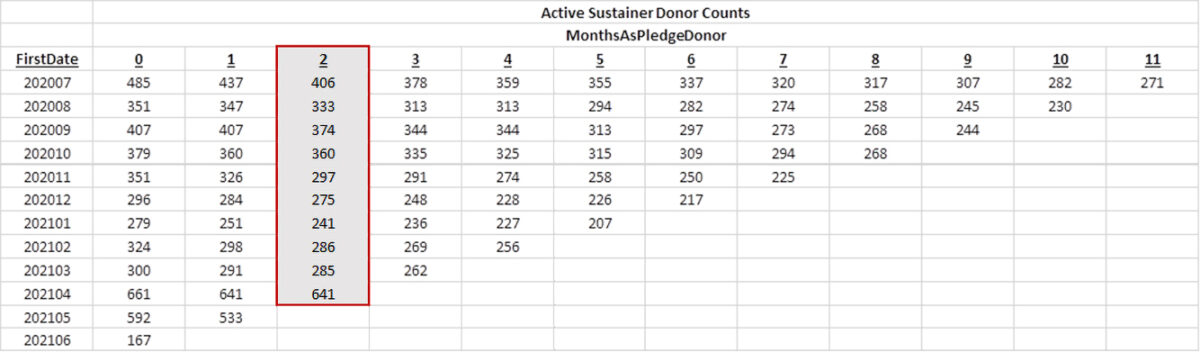
- To read a row is to follow a class of donors. In the highlighted row below we see that 379 new sustainer donors came on in October 2020. Of those donors, there are 268 donors who donated 8 months out (June 2021).
- To read a column is to understand what happens to donors after they have been in the program a certain amount of time. In the highlighted column we can see how many donors tend to retain two months after. This will be a very helpful view when we explore variations of this concept such as retention triangles.
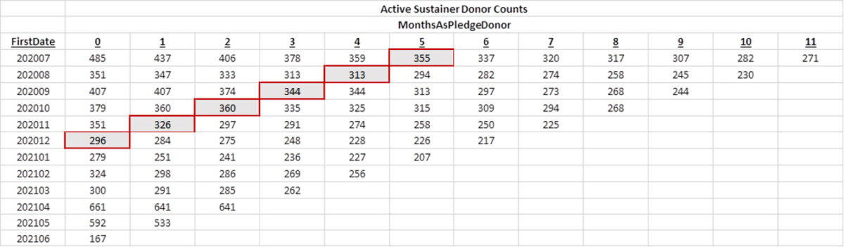
- To read on a diagonal is to understand what happens in a calendar month. In the highlighted diagonal we see how donors tend to retain specifically during December 2020. This can be helpful to understand things like year-end giving and outside events such as national disasters on a program.
What do I do with a triangle?
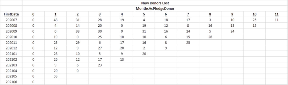
There are many uses for triangles. We can subtract columns to find incrementally how many sustainer donors are lost each month:
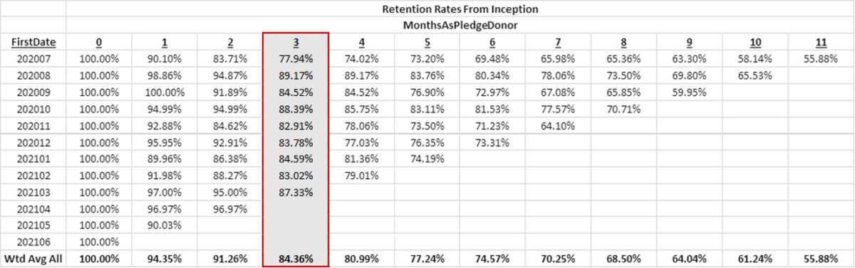
We can look at the ratio of any given column to the inception column (Month 0) to see what proportion of new donors are retained as time passes from when they entered the program. This is when reading along a column is very helpful. This view shows that on average 84.36% of new donors retain three months after they become sustainers.
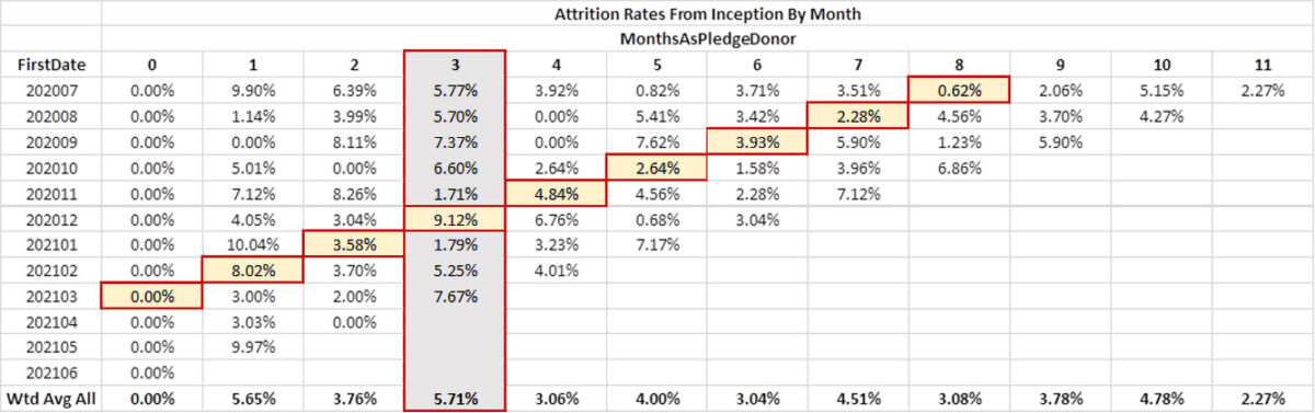
We can also look at the number of donors lost by month as a ratio to the new donors to understand attrition rates as a function of how long a donor has been in a sustainer program. With this view I might notice that 9.12% seems high for that column. I know since it is in “Month 3” for those entering the program in December 2020 that we had a higher than expected drop off in March 2021. I can compare along the diagonal to see if it seems like a drop off happened in March 2021. I see that 9.12% still seems a bit high in that direction as well. To help better understand what happened, the conversation is extended to the nonprofit to see if there was any issue with payment processing or shifts in the program that is causing the spike. Context matters greatly when completing data analysis. Triangles can provide a roadmap to the story the data is telling so we have direction for how to more deeply explore and understand the program.
Why should I love triangles?
Today we focused on a very particular use of triangles. These can also be used to track a donor class journey with respect to number of gifts, revenue, average gift size, etc. It can be limited to a single program or expanded to all giving. The possibilities are nearly limitless once the foundations are mastered. It is also a reminder that the ability to collaborate across industries results in richer, more accurate, and deeper analysis tools built to solve sundry business problems.
Blog written by Ryan Byrd | Senior Data Analyst